
Adding text
This allows you to add a single piece of text which will go on top of your selected icon.
See Select icon wizard - Options tab for information on the preview options.
The font and colour options are straight forward. Select the font and colour as required.
Advanced users
The text box supports the use of Repeat Basic HTML so that you can mix fonts, and formatting, and make individual words bold, italic, etc. This requires a basic knowledge of HTML. Please contact support@repeatsoftware.com if you need any help.
Options on this page
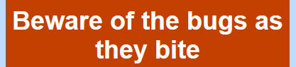
Text width % - This defaults to the width of the icon. If you have a long line of text then text is automatically wrapped onto the next line. For example:
Setting the text width, to say 50%, has the effect of wrapping centered text like this:
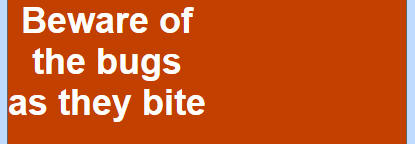
The text is still centered but within a rectangle that is half the width of the full icon. This is positioned on the left side, so you if wanted to move it more centrally then use the 'Left offset %' box.
Text align - Options are CENTRE, LEFT and RIGHT.
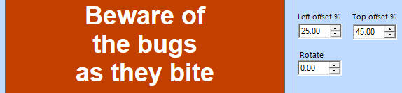
Left and top offset % - The starting point for text is in the top left corner. You can then use the left and top offset boxes to position your text within the icon's background.
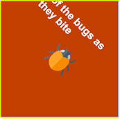
Rotate % - You can rotate text to any angle. This is done around the centre point of the text. So rotating:
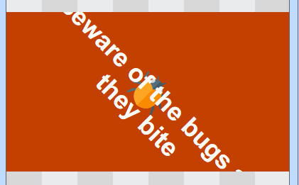
by 45-degrees gives you:
which is out of the icon's background. So you then need to use the 'Top offset %' to say 40% to move the text back within the icon's background:

Also make sure you set the preview shape to the same shape as the Picture or Banner control you are using this icon with. So if the final control is long and thin, using the 16:9 preview will again put the rotated text outside the background.
Obviously, you can adjust the positioning size and position of the font as necessary.
This allows you to add a single piece of text which will go on top of your selected icon.
See Select icon wizard - Options tab for information on the preview options.
The font and colour options are straight forward. Select the font and colour as required.
Advanced users
The text box supports the use of Repeat Basic HTML so that you can mix fonts, and formatting, and make individual words bold, italic, etc. This requires a basic knowledge of HTML. Please contact support@repeatsoftware.com if you need any help.
Options on this page
Text width % - This defaults to the width of the icon. If you have a long line of text then text is automatically wrapped onto the next line. For example:
Setting the text width, to say 50%, has the effect of wrapping centered text like this:
The text is still centered but within a rectangle that is half the width of the full icon. This is positioned on the left side, so you if wanted to move it more centrally then use the 'Left offset %' box.
Text align - Options are CENTRE, LEFT and RIGHT.
Left and top offset % - The starting point for text is in the top left corner. You can then use the left and top offset boxes to position your text within the icon's background.
Rotate % - You can rotate text to any angle. This is done around the centre point of the text. So rotating:
by 45-degrees gives you:
which is out of the icon's background. So you then need to use the 'Top offset %' to say 40% to move the text back within the icon's background:
Also make sure you set the preview shape to the same shape as the Picture or Banner control you are using this icon with. So if the final control is long and thin, using the 16:9 preview will again put the rotated text outside the background.
Obviously, you can adjust the positioning size and position of the font as necessary.