
By the time you get to this screen, you will have selected the icon and colours you want to use. The options tab gives you control over how you want the icon to be displayed, and optionally, allows you to add other icons and text to build up a standalone picture or information slide.
Basic options for sizing, positioning and rotating
Final shape preview - When you use your icon in your presentation, the your Picture control, Banner control, etc, will be a certain size and shape. For example it could be a 400x300 pixels. This means that the shape will be 4:3. You can change the preview shape to make the shape of your control, which will give you a better final result.
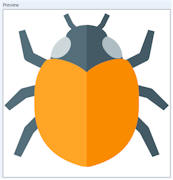
Icon Size % - This is the icon at full size such as:
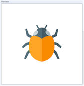
However, you may want more background around the icon. For example, reducing it to 50% size gives:
You can also set this to higher that 100%.
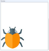
Position - If you have the icon at full size, i.e. 100%, then this drop down list doesn't do anything. However, if you lower the size of your icon to 50%, for example, then you can position it within the background, for example, "BOTTOM LEFT":
Left and top offset % boxes - These just allow you to move a positioned icon slightly left or right, or up and down, so that you can precisely position your icon within the background.
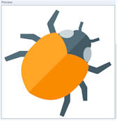
Rotate - You can rotate your icon to any degree, for example 45-degrees:
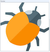
At 100% size, this may rotate your icon out of the background box like in the above bug picture. Part of the bugs legs are missing. This is where the percent size is useful. Changing to 85%:
reduces the size of the icon, which will now fit with the background when rotated.
Adding text and sub-icons
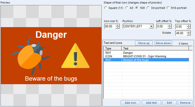
In the above example, we have used the 'Text and icons' list to build up a sign by adding text and a warning icon to our bug icon. The final picture control in your Repeat Signage presentation may be a widescreen shaped rectangle, so we have first changed the preview to 16:9, so that our preview shape matches our final icon. We then used the 'Add icon' button to display another screen which allows us to select an icon (with options for sizing, positioning and rotating). We then used the 'Add text' button twice to add to two text labels onto the icon. Again, the screen that is displayed to added text allows you to select a font, colours, size, position and rotation of the text.
This can be useful to quickly build up a poster or sign when can then be played as part of a picture play list with our Picture control or Banner control.
When you click on either 'Add icon' or 'Add text' then use the help buttons on the screens that appear for additional help.
Items in the list can be deleted by selecting and using the 'Remove' button, or edited by double clicking them. The 'Move up' and 'Move down' buttons control the stack order (z-order). For example, here is a text and icon in the list:
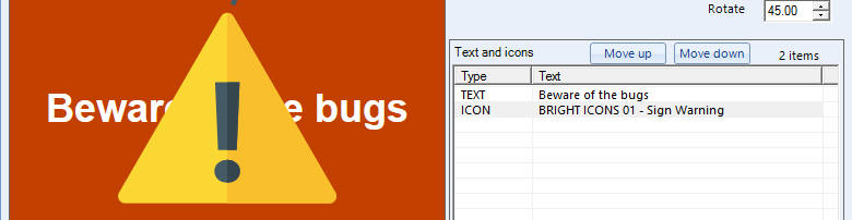
The warning sign icon is second in the list and goes on top of the text. Selecting the warning sign icon in the list and using 'Move up' gives us:
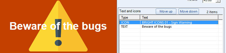
instead. The main icon you have selected will always be at the back.